Designing an App Using AI AI-Augmented Design to Empower End-Users Through Interaction
Overview
Role: Design Strategist · Researcher · Product Designer
Organization: Independent Design Science Project
Industry: Large-Scale Social Platforms · Algorithmic Systems · Platform Governance
Engagement Type: Experimental Prototyping · Research-Through-Design · Technical Specification & Architecture
Focus: Interaction Design · Systems Thinking · AI-Augmented Design · Global Product Experience · Ethics & Governance
Project Context
STOA began as a self-initiated project to explore my full design capability outside the constraints of an employer or client.
The catalyst was a convergence of:
Long-standing failures in social media governance
Contemporary critiques of centralized moderation (including arguments for protocol-based approaches)
My own early career experience designing ad-hoc moderation systems in the early 2000s, before UX was a defined discipline
The guiding question was:
What would a social media experience look like if it helped people understand and interpret their feeds—rather than quietly controlling them?
Iterative Systems & App Design
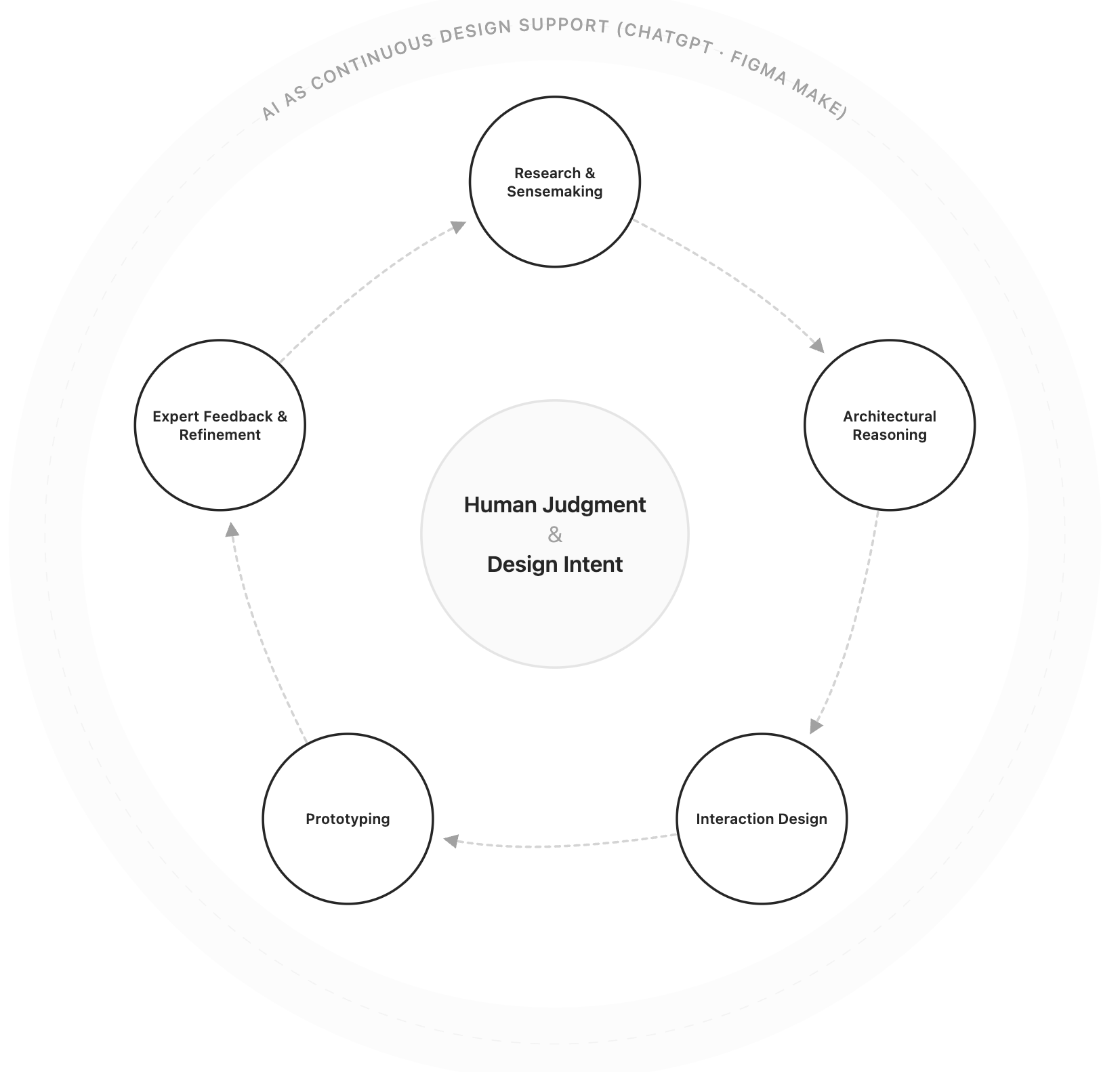
Continuous Design Lifecycle
A visual system representing the iterative relationship between human judgment, design stages, and AI support.
The STOA project has evolved through continuous, overlapping cycles of:
Research and sensemaking
Architectural reasoning
Interaction design
Prototyping
Expert feedback and refinement
AI tools (ChatGPT and Figma Make) were used throughout the lifecycle, not in a single phase. This allowed me to iterate rapidly without sacrificing rigor—moving fluidly between thinking and making as new insights emerged.
Through research, expert feedback, and prototyping, I arrived at a core insight that shaped every interaction decision:
The problem is not a lack of transparency—it’s a lack of legible transparency.
Users don’t primarily need:
More policy documents
More reports
More controls
They need clear, contextual explanations when governance affects them.
This reframed social media governance from a policy or compliance issue into an interaction design problem.
That reframing is the foundation of the STOA app.
A Critical Reframe That Shaped the App
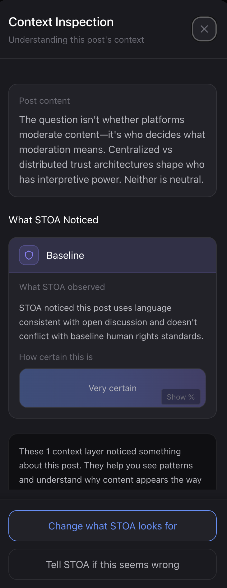
The first STOA prototype emphasized explicit transparency and regulatory legibility through post-level labels and intent classifications. While effective for demonstrating compliance concepts, this approach risked replicating the visual and emotional patterns of moderation systems.
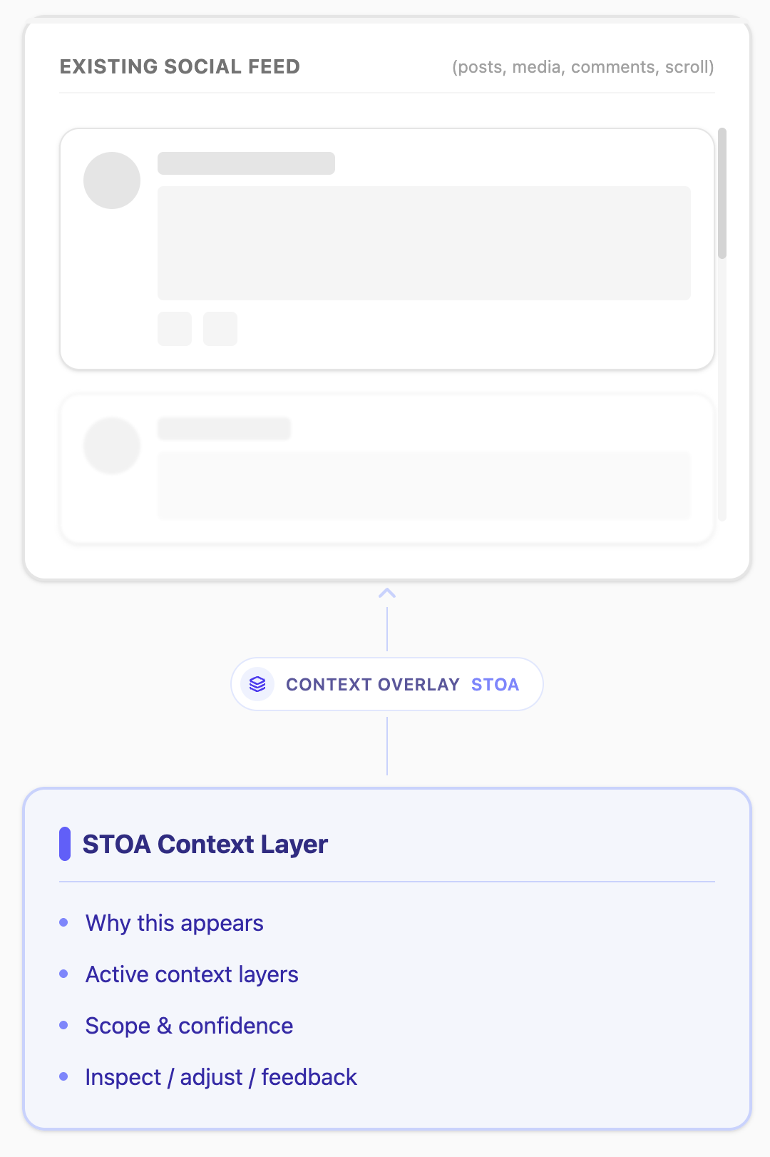
The current version shifts toward a pattern-based, feed-integrated model that emphasizes calm interpretation, user agency, and epistemic humility. Context is no longer presented as a verdict on individual posts, but as an ambient, inspectable layer that reveals how information environments are shaped over time.
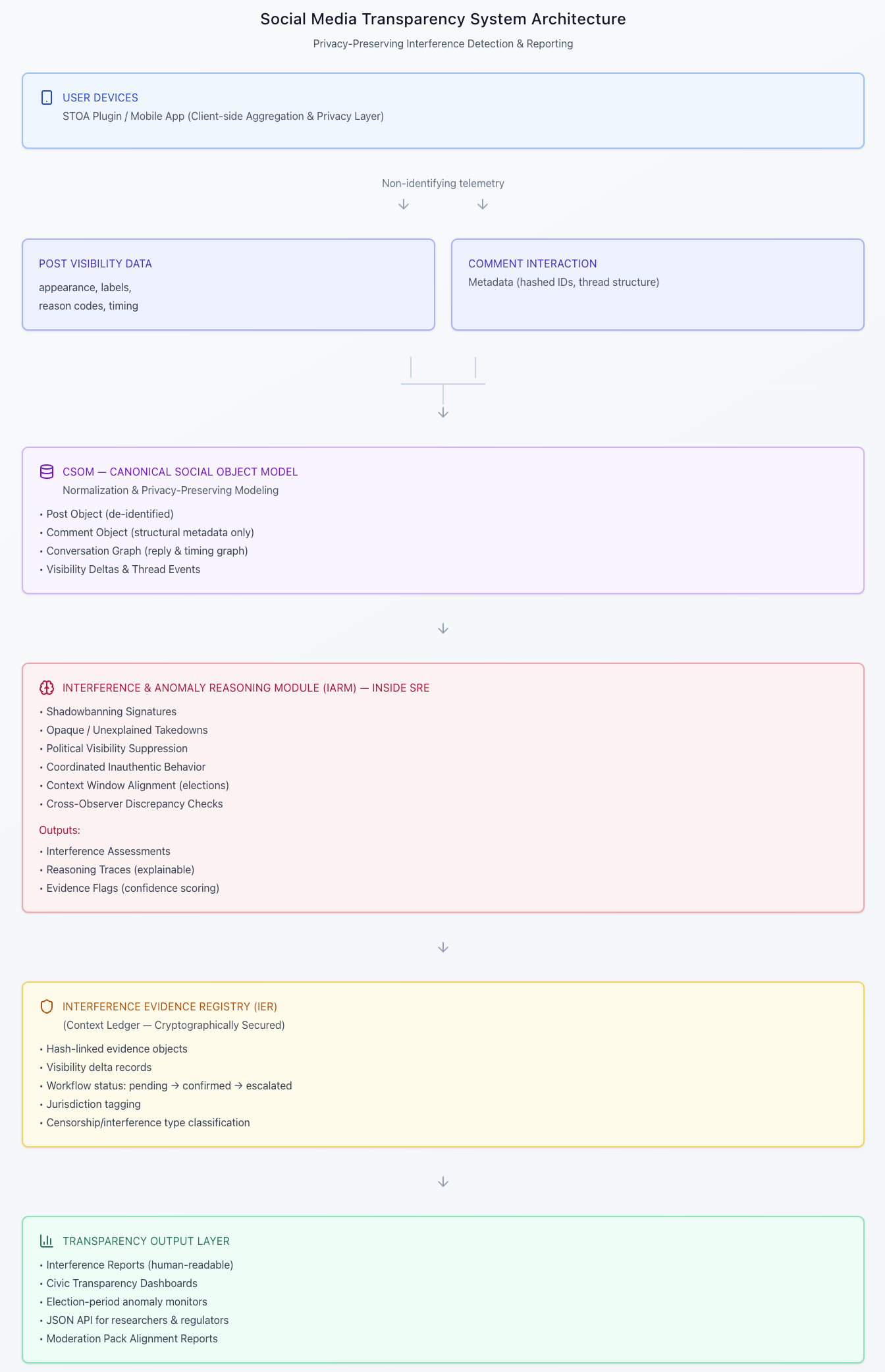
Key Architectural Decisions
Before designing the app experience, I resolved two constraints that defined what the UI could responsibly do:
STOA could not be a platform
It could not host content, enforce moderation, or replace social media feeds.STOA should not decide meaning
It should allow users to add context and inspect interpretation without replacing human judgment.
This led to:
CSOM as a common language for representing feed content
User-governed Context Layers instead of enforcement
Inspectable reasoning, not verdicts
With those boundaries in place, the focus shifted fully to interaction design. (You can read more about the systems thinking and technical specifications in the other STOA case study.)
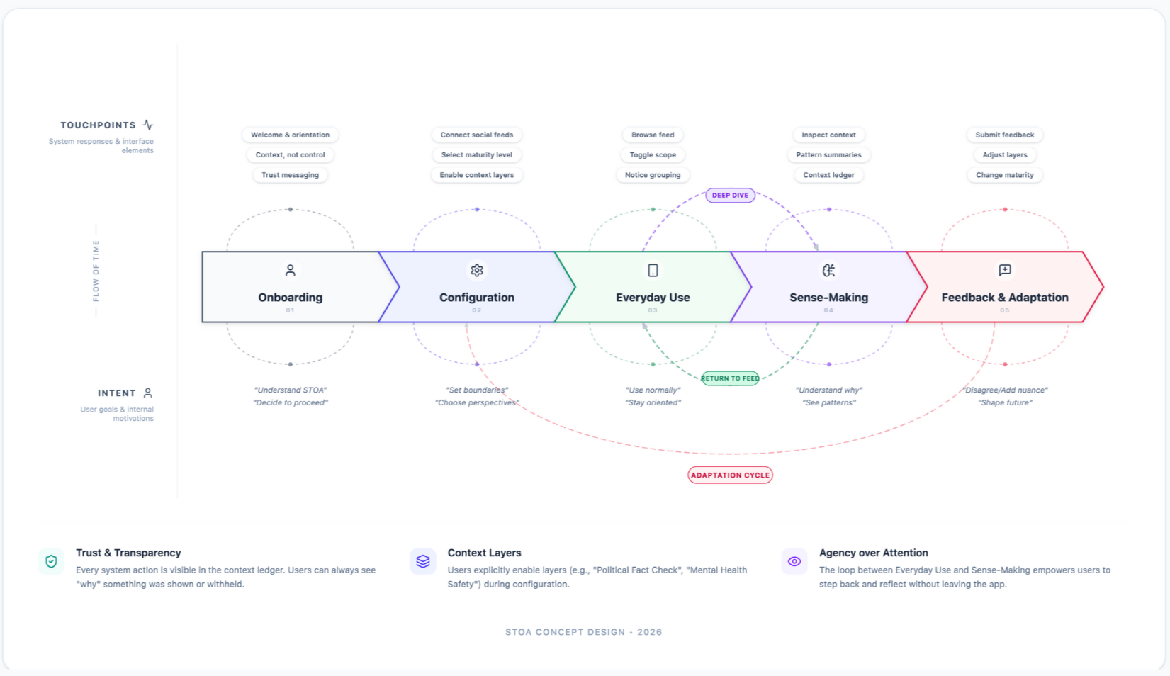
This journey map illustrates how users move through STOA from initial onboarding to sense-making and feedback. Rather than a linear funnel, the experience is designed as a set of connected phases—onboarding, configuration, everyday use, sense-making, and feedback—linked by intentional loops. Users can browse their feed normally, step into deeper context when something raises questions, and return seamlessly to everyday use. Feedback and adjustments feed back into configuration, reinforcing STOA’s core principle: transparency is ongoing, user-governed, and adaptive over time.
STOA User Experience Journey Map
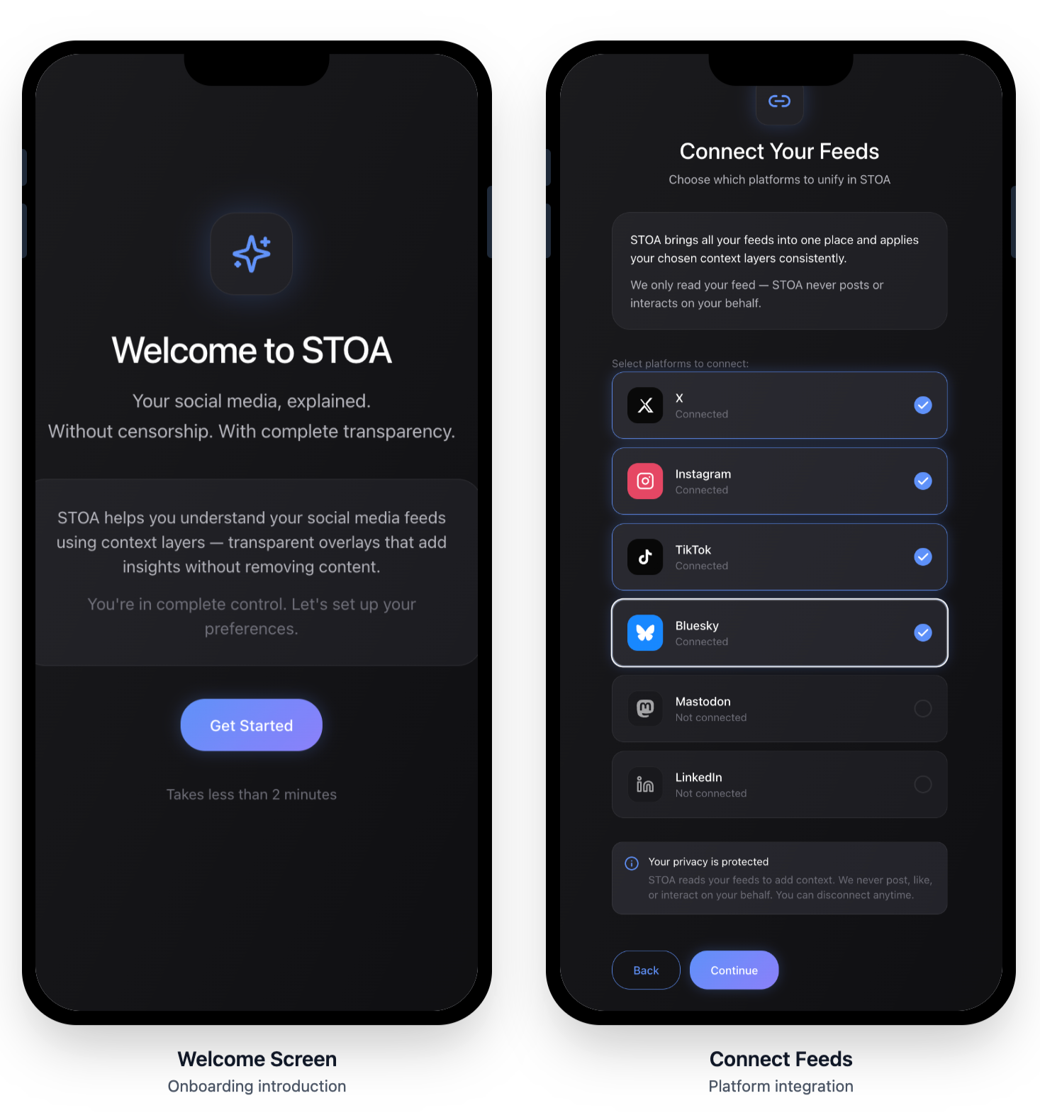
Designing the STOA App
The App as an Interaction Testbed
The STOA app was built to test a specific hypothesis:
Interaction design itself can empower users—without giving them control or enforcing ideology.
Rather than wrapping the protocol in UI, I treated the interface as the primary mechanism for agency, literacy, and understanding.
Starting with Familiarity
Because STOA sits alongside existing social platforms, it needed to feel immediately familiar.
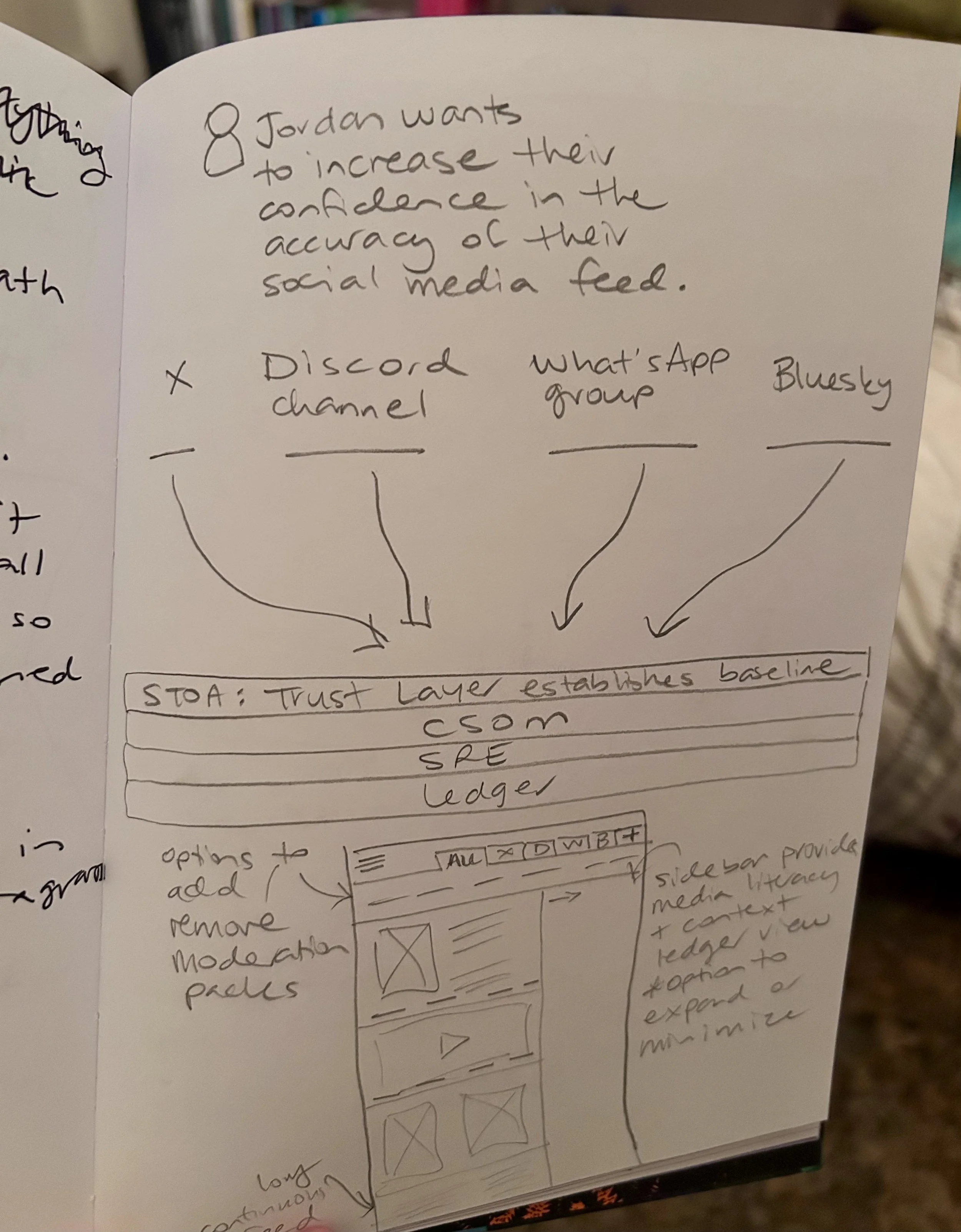
I began by:
Sketching flows in my notebook
Mapping feed behaviors by hand
Reviewing hundreds of screens across mainstream social media apps
This helped identify:
Patterns users already understand intuitively
Where friction is acceptable vs disruptive
Which conventions could be reused safely—and which needed to be redesigned
The goal was cognitive continuity, not novelty.
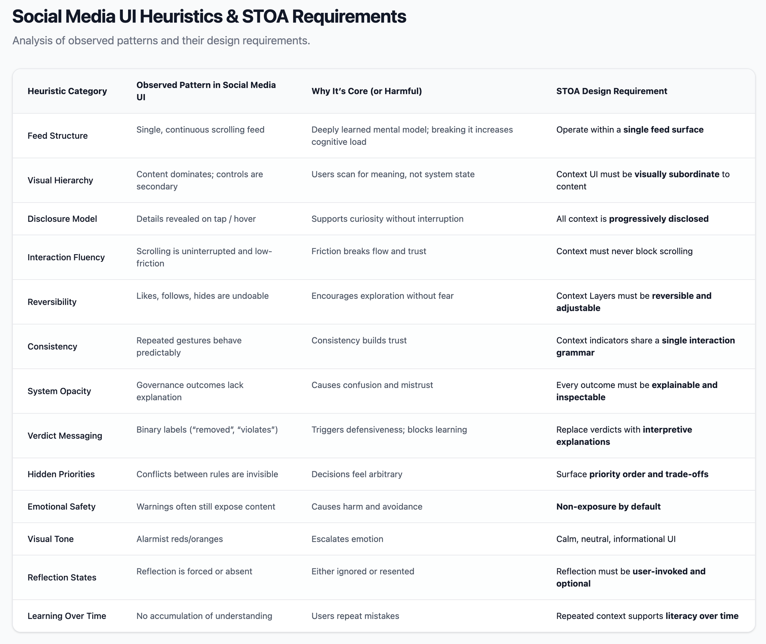
STOA intentionally adopts recognizable structures:
A feed
Scrolling content
Tap-to-expand interactions
But it repurposes them for a different intent:
Exploration instead of engagement
Inspection instead of reaction
Context instead of amplification
This design choice is grounded in research showing that:
Users accept decisions they understand, even if they disagree
Short, contextual explanations outperform long disclosures
Legibility reduces frustration and perceived arbitrariness
The interface needed to support learning, not compliance.
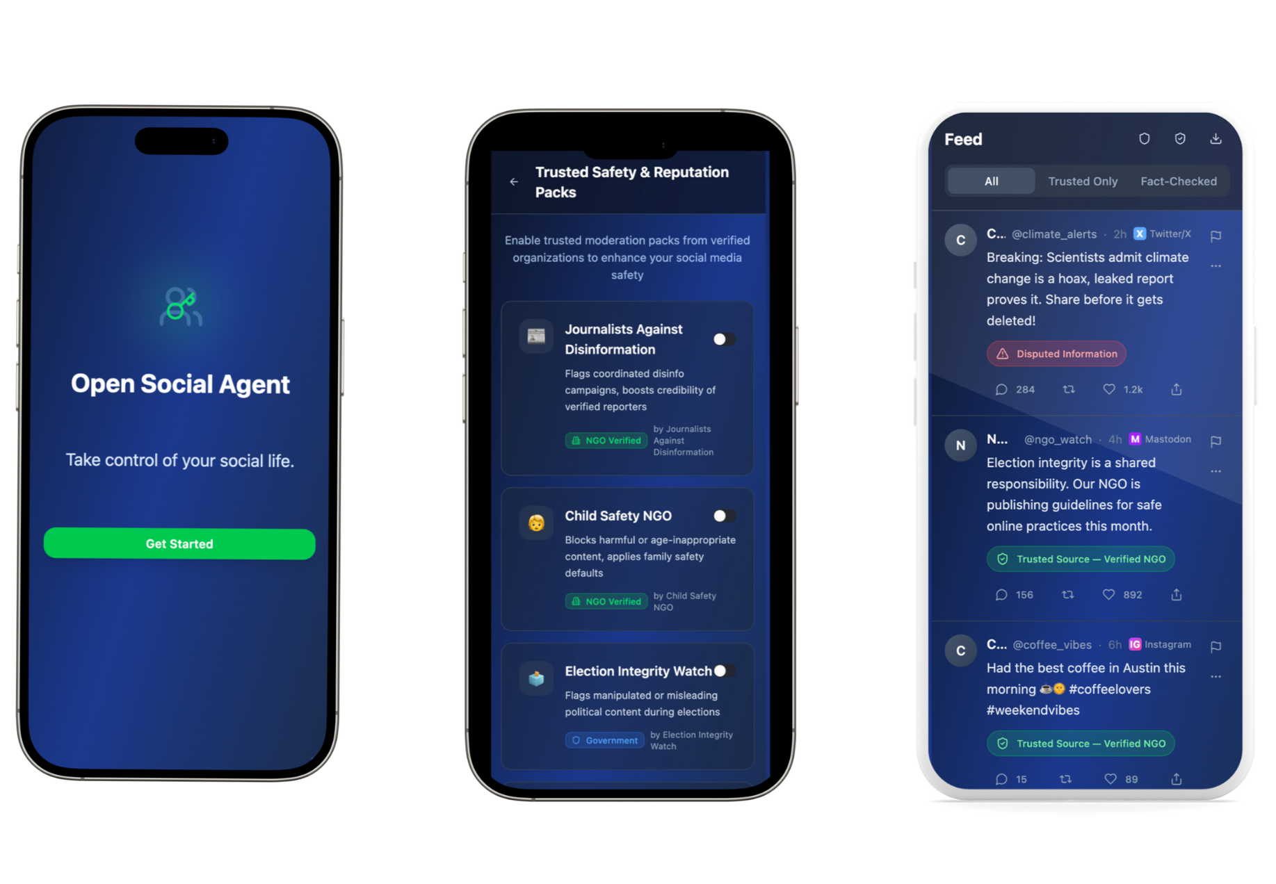
Familiar Form, Different Power Dynamics
Designing Context as Interaction
One of the most important design findings applied in the STOA app was this:
Users don’t want appeals or escalation paths. They want context.
As a result:
Explanations are optional, not forced
They are short, contextual, and scoped
They surface assumptions, priorities, and uncertainty
They avoid verdict language (“violation,” “safe,” “allowed”)
This directly shaped:
Context indicators in the feed
Inspection drawers
Conflict-resolution views
The goal was to reduce miscalibration and overconfidence—helping users form accurate mental models of what the system can and cannot do.
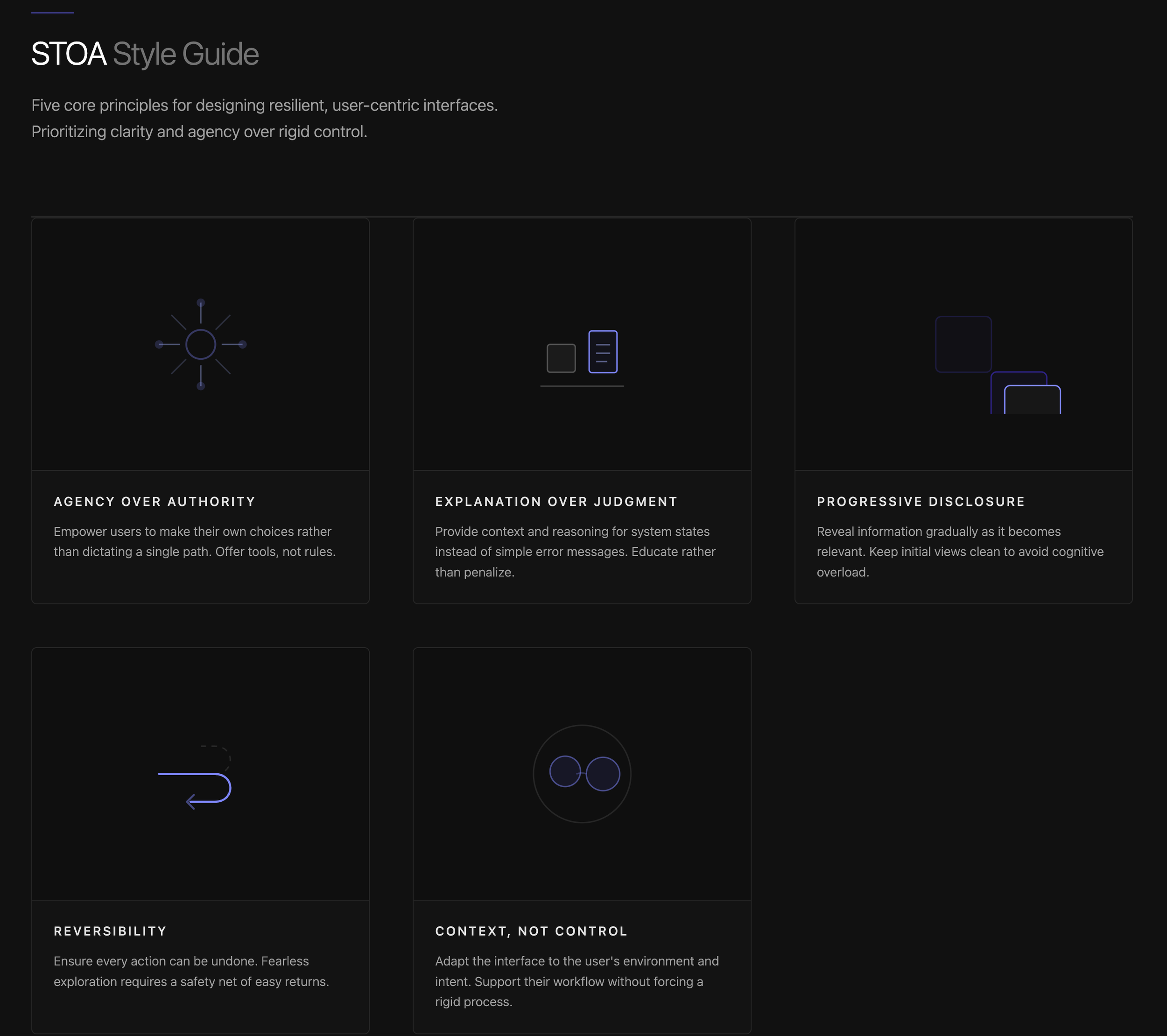
Translating Principles into UI Rules
Before designing screens, I translated system values into explicit interaction constraints, including:
A single feed surface (no dashboards or review modes)
Progressive disclosure only
No binary judgments or enforcement states
Neutral, calm visual language (no alarmist cues)
Non-exposure to harmful or traumatic content by design
These rules ensured the interface reinforced agency rather than authority.
Using Figma Make to Build a Cohesive UI System
I used Figma Make deliberately as a system accelerator—not a design decision-maker.
I finalized the IA first:
Feed
Context drawers
Deep-dive inspection views
Onboarding and account connection
Layer selection and feedback states
This defined how many screens were needed and how they related.
Step 1: Define the Information Architecture
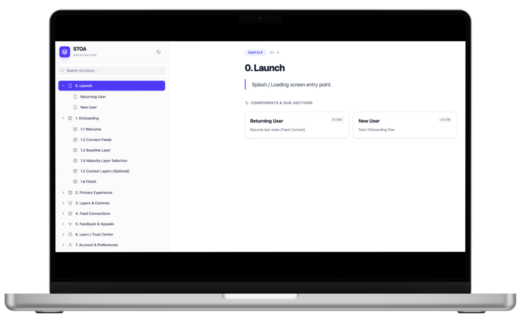
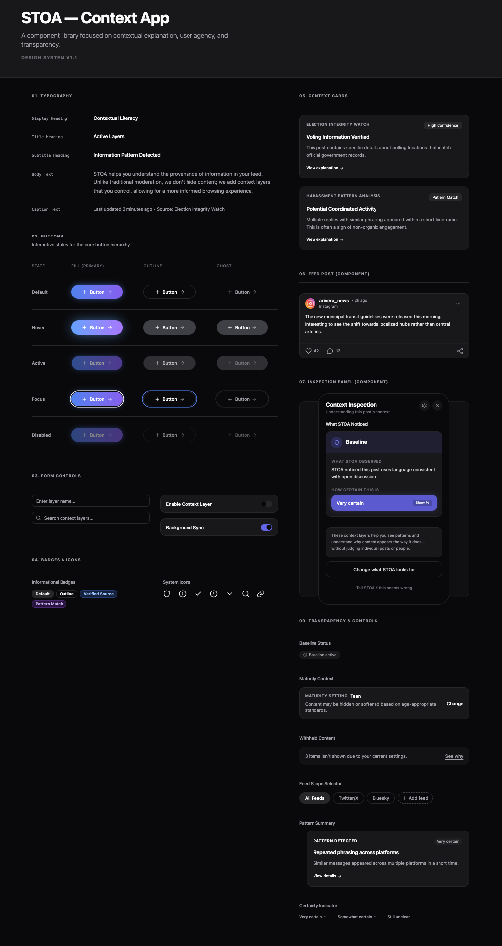
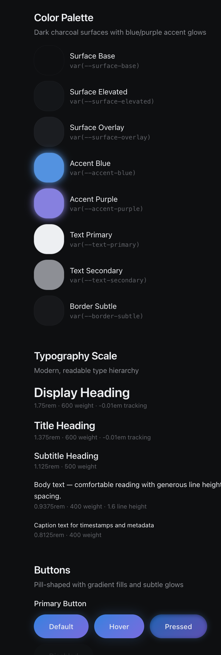
Step 2: Generate the Component Library and Style Guide
Next, I instructed Figma Make to generate:
A foundational component library
A style guide aligned with design principles
Reusable interaction patterns
By generating components before screens:
Visual cohesion was guaranteed
Patterns were reused, not reinvented
Iteration became system-level, not screen-level
AI instantiated the system—it didn’t improvise design intent.
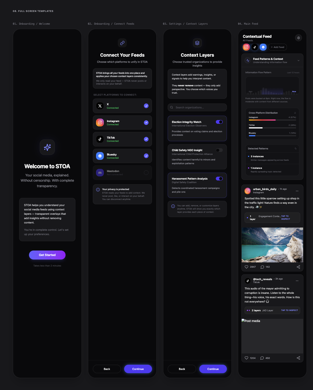
Step 3: Generate Screens from the System
Only after the system was in place did I generate the full prototype.
Because everything was component-driven:
Screens shared a consistent look and feel
Changes propagated cleanly
The prototype was easy to refine and test
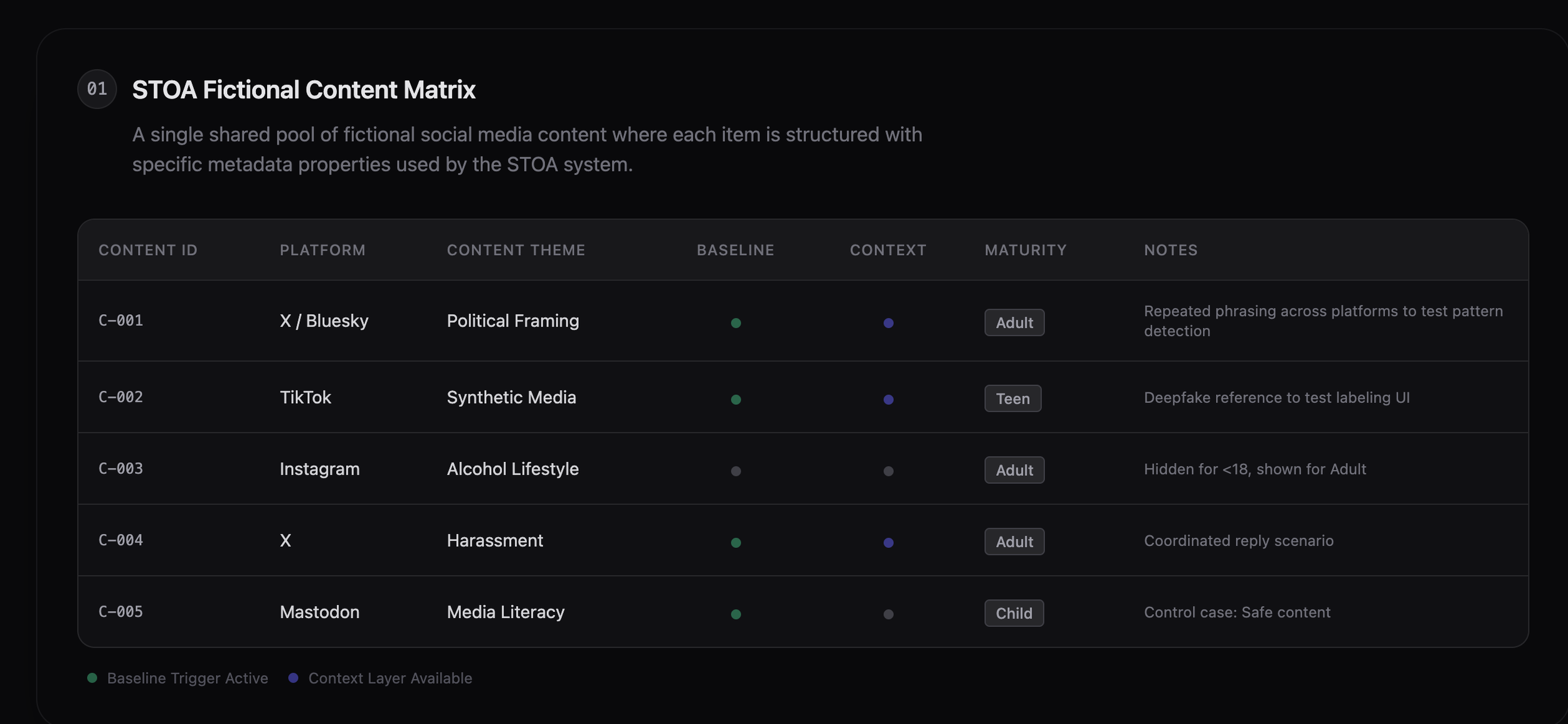
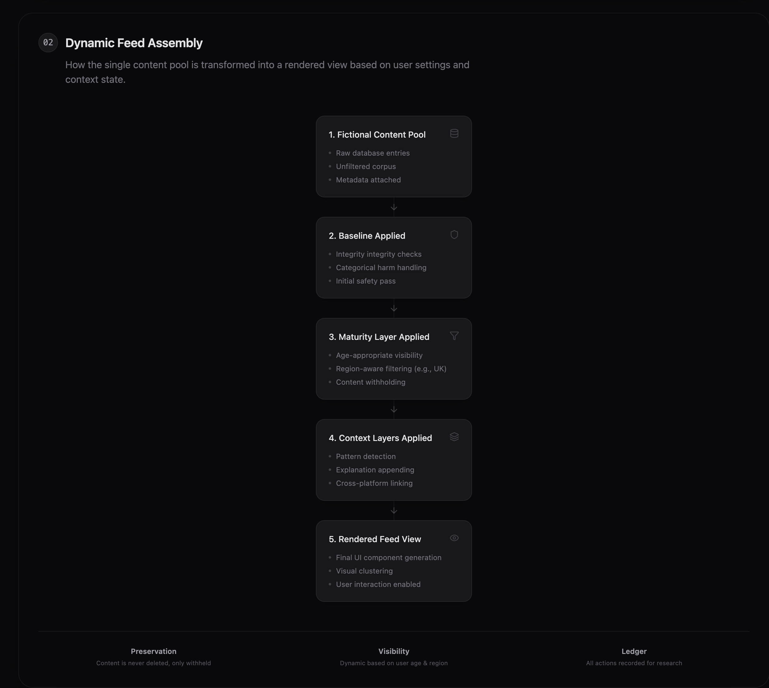
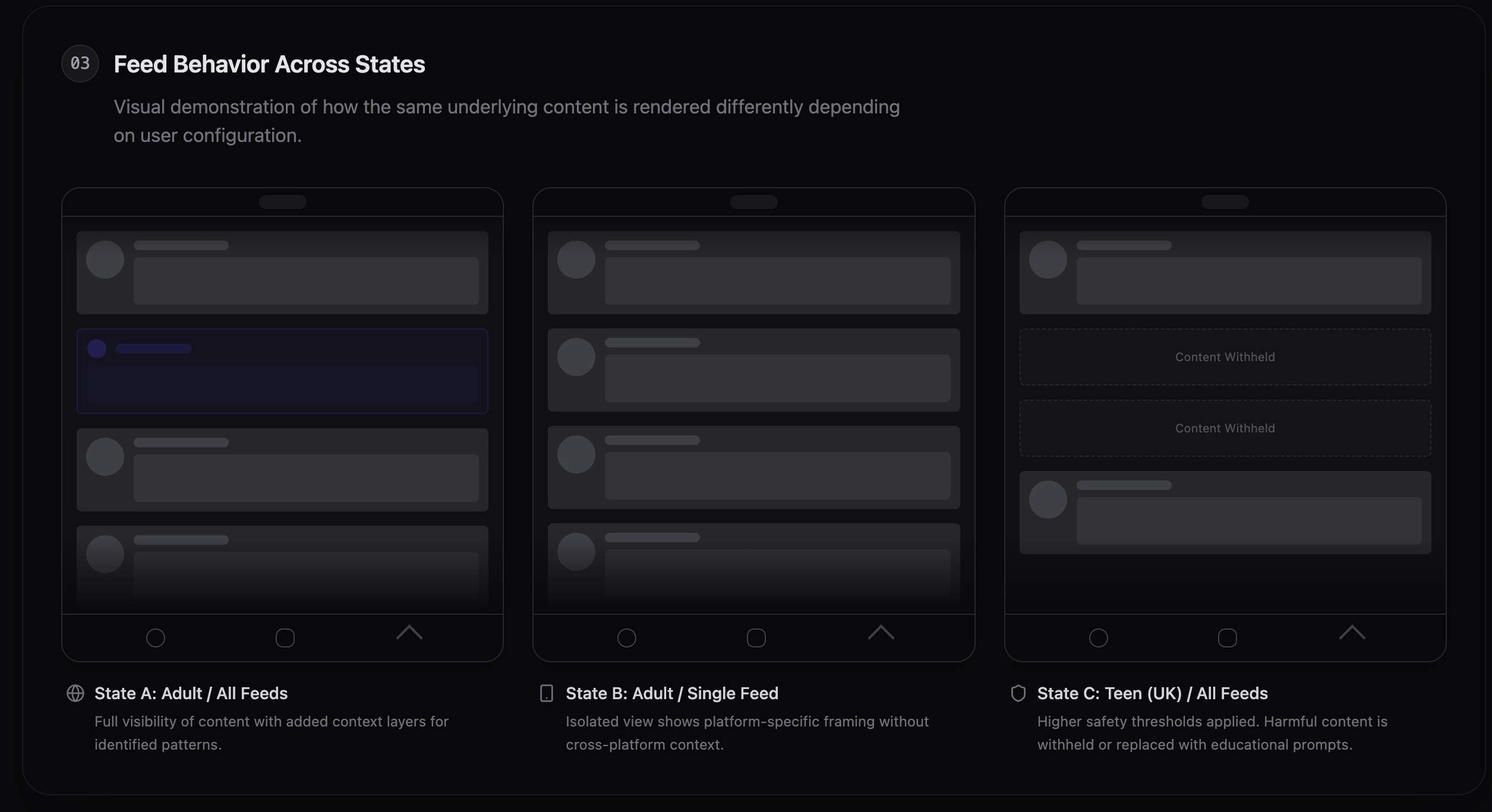
Step 4: Populate Fictional Content to Support Interaction
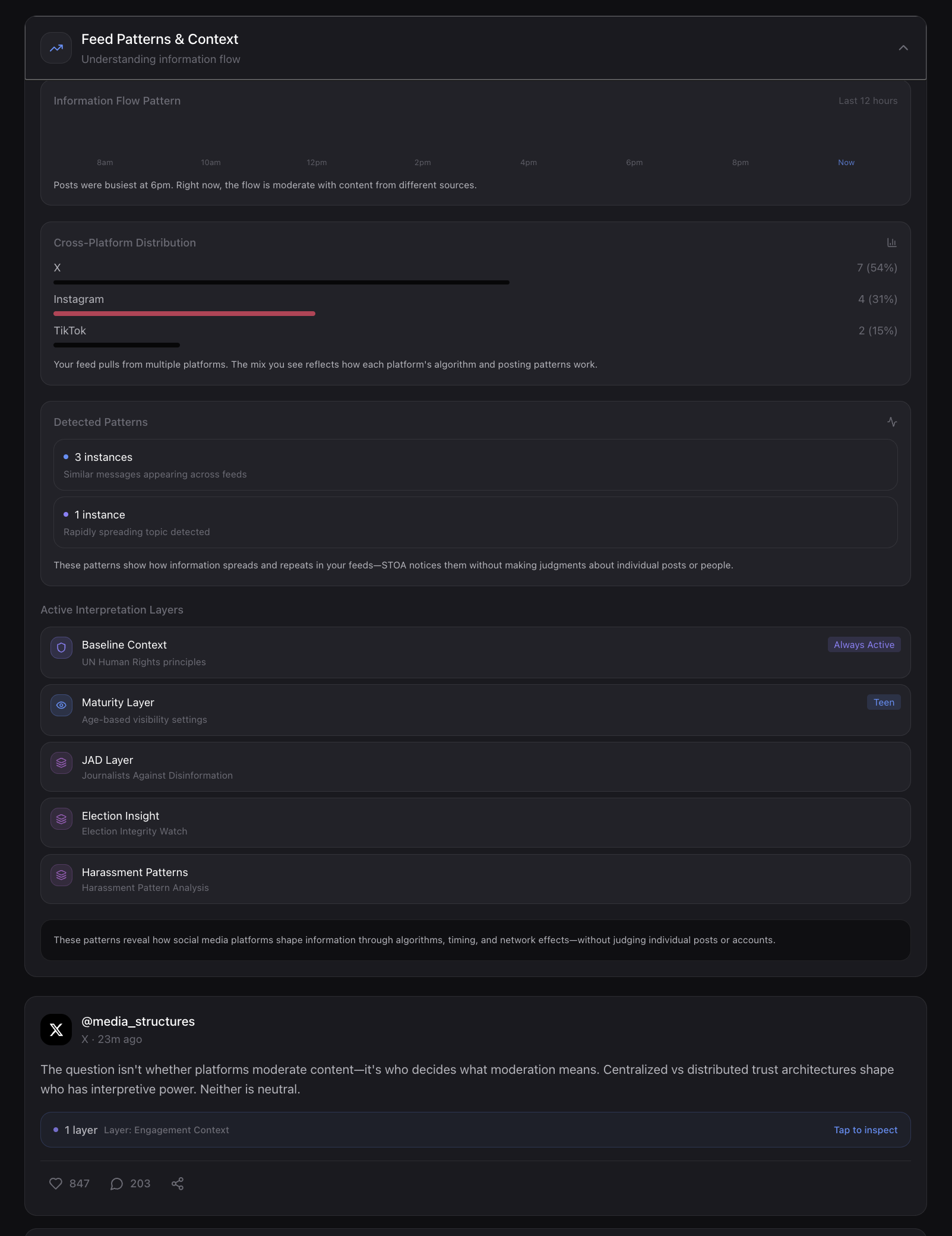
To evaluate STOA’s interaction model without relying on live social media data, I constructed a pool of fictional social media content. Each item was deliberately designed to represent common platform dynamics—such as cross-platform repetition, age-restricted themes, coordinated engagement, and benign control cases—and was annotated behind the scenes with platform, maturity relevance, and applicable context layers.
During interaction, the feed shown to participants was dynamically assembled from this pool based on selected platforms, enabled context layers, and maturity settings.
This approach allowed me to demonstrate how STOA’s interface responds to different configurations while preserving a consistent underlying content set, making changes in visibility, grouping, and explanation both intentional and inspectable.
From System Shell to Testable Prototype—In a Few Days
Once the architectural and UI systems were in place, I had the shell of the app.
From there, I was able to design a fully functioning, polished prototype suitable for expert testing within days.
In a traditional process, this level of work would typically require:
Multiple designers
Extensive handoffs
Heavy documentation overhead
By designing the system first and using AI as a constrained accelerator:
I reduced production drag
Maintained a single design vision
Moved directly from insight to experience
The design became the documentation.
Research-Backed Design Credibility
The STOA interaction model and prototype are also the basis of a peer-reviewed research paper accepted for publication by HCI International.
The paper validates STOA’s core interaction insights:
Transparency works when it is legible, contextual, and optional
Explanation design shapes trust more than raw disclosure
Literacy emerges through interaction, not instruction
The research and the app evolved together—each informing the other.
Final Reflection
STOA demonstrates how:
Complex governance problems can be reframed as interaction challenges
Familiar UI patterns can be repurposed to shift power toward users
AI can accelerate rigor without replacing human judgment
At its core, this project explores a simple idea:
Designing better systems starts with designing better interactions.